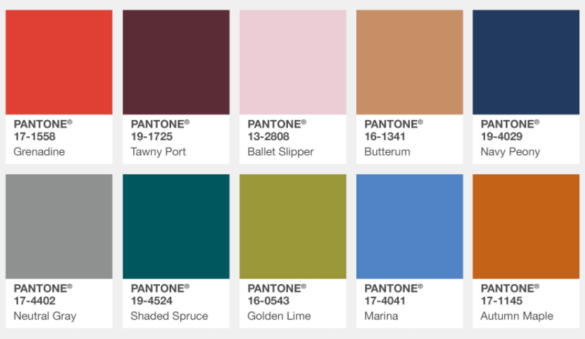
When changing out your décor this season, embrace Pantone’s picks for the hot colors this fall. Besides choosing the Color of the Year, Pantone shares their shades of the upcoming season, based on trends from New York Fashion Week.
While, the colors are chosen to enhance wardrobe trends, the forecasted picks will also find their way into your home décor. The 10-hottest colors for fall vary from pastel neutrals to saturated jewel tones.
This color palette for Fall 2017 leans more to warmth, they’re more comforting and welcoming for the season. Pantone also chose a few standout shades including a pale pink, a refreshing green, and a bright blue that pair well with autumn’s classic shades you’d see driving through New England. Pantone described the colors in a statement as all are “earthy tones with a twist.”
Below are the 10-shades from Pantone’s fall 2017 report and how you could easily be incorporate the hues into your home.
Grenadine
This fierce orange-red is definitely not for the timid. It’s a warm, powerful color that will command attention in a room. You can use this color to make a statement with a headboard or use it as a pop of color in a pillow or vase. Use this color sparingly if you plan on selling, maybe highlight it in a family or kid’s room.
Pantone Grenadine [Shop the Look]
Tawny Port
If a bold red isn’t your color, try Tawny Port, a deep, sophisticated hue that can be used as an accent color in a master bedroom, formal living room or dining area. This hue works well with textures and patterns (just look at the lush couch or furry pillow). Tawny Port will work well with neutrals, it’s lighter pale pink cousin Ballet Slipper or I could see pairing the jewel tone with Golden Lime or even Marina for a complimentary look.
Ballet Slipper
This rosy hue works well beyond a child’s room. While many may think Ballet Slippers is best suited for a newborn baby, check out how this pale pink is taking the home decor industry by storm. You can use this color in a kitchen, bathroom or a sitting area. This color can be used as a neutral with any of the colors in this fall palette. (Which one would you pair it with?)
Butterum
This is a catch all color, it would work well in any room. This rich, warm beige can be an accent color when paired with neutrals or could look great paired with Golden Lime, Shaded Spruce or Tawny Port. Try this color in pillows, throws or even window treatments.
Navy Peony
This traditional color isn’t anything new! Navy Peony is a solid, stable hue that could easily be used on the walls in a bedroom or study. You can feature the beautiful shade on the couch or dining table by adding a fresh accessories. It’s important to note, the new twist on this color is its presence in tribal, marble and ikat patterns.
Neutral Gray
Well, if you thought gray was out…think again. This is the classic shade of gray that pairs well with white to create a classic design. This color can also bring out your marble tile and accents– a popular trend right now in homes. While this color can be paired with other colors to be the neutral tone, I like the idea of pairing it with Butterum, creamy whites and organic materials to warm up the gray.
Shaded Spruce
I’m in love with Shaded Spruce, a jewel toned blue-green. Slightly richer and darker than Pantone’s Color of Year Greenery, this evergreen shade can create a sophisticated or playful room depending on the colors it’s paired with. Shaded Spruce can be the perfect shade to use as a jumping off point to pair with other blues and greens to create one harmonious room. On the other hand, it’s a great way to make warm toned pieces pop when placed against Shaded Spruce painted walls.
Golden Lime
This color can get overpowering quickly, so start small by introducing Golden Lime as part of a textile pattern or in a piece of art. You can also try the bright green in an accent piece of furniture like a chair, ottoman or table. Just make sure that you use the color near the focal point or positive features of the room to highlight the space. By strategically placing this color throughout a space you’ll be directing the eye around the room.
Marina
This is the only true cool color in the fall palette, according to Pantone. Fall is usually overwhelmed with warmer tones, but you can create balance in a space with Marina. This is a brilliant shade to pair with the other colors in this palette to create a fresh, yet calming color combination that truly represents nature.
Autumn Maple
Autumn maple is a muted shade of orange-brown that can be similar to rust. The saturated hue is one of the spicier autumnal tones, that can be displayed in a rug, light fixture or do I dare say wallpaper? While Autumn Maple may sound and look good for fall — I think the hue could do well in a summer palette as well. So, why not take a risk and use this bold color as a major statement piece in a room.
Happy Decorating,


