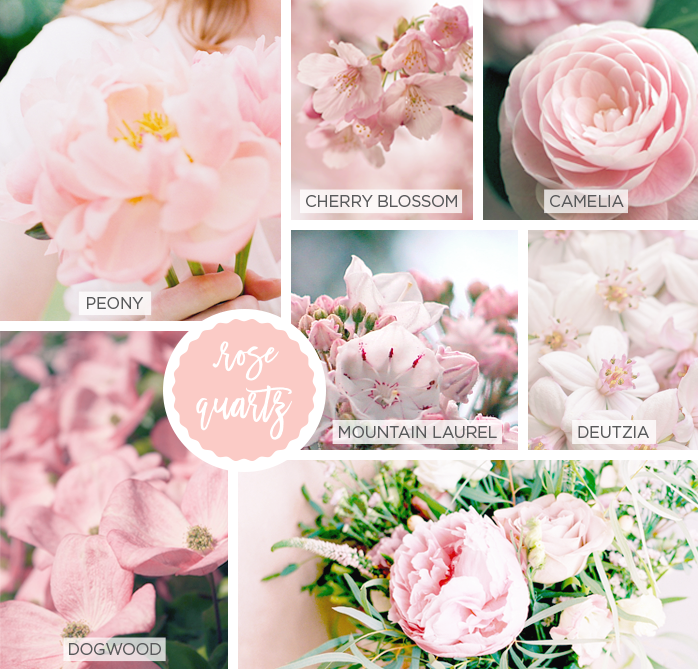
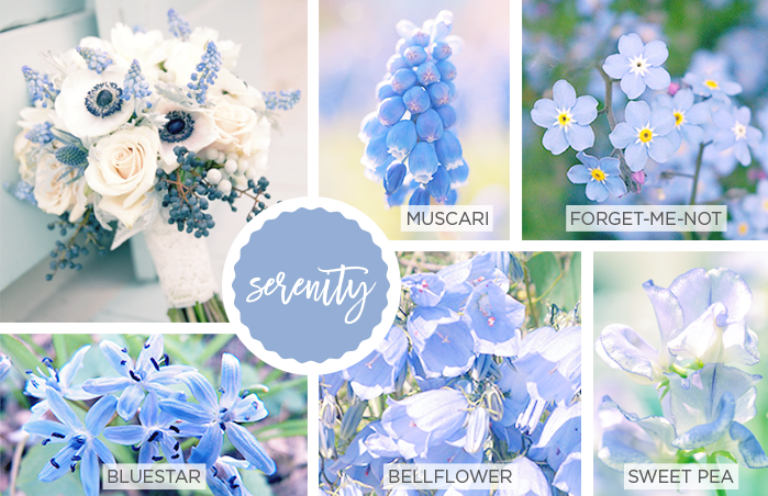
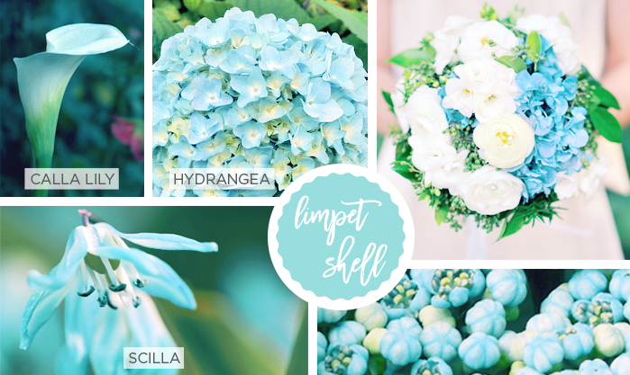
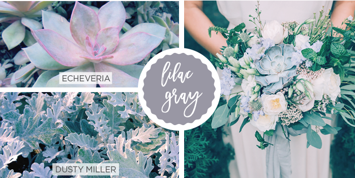
This year was the first year Pantone named two colors of the year instead of one — rose quartz and serenity. They’re softer tones than in years past and are meant to channel mindfulness and well-being.
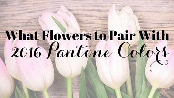
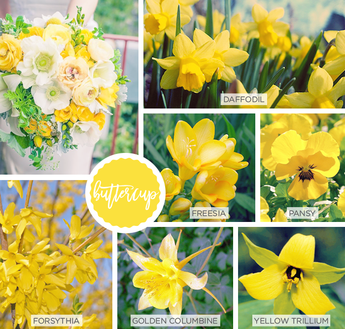
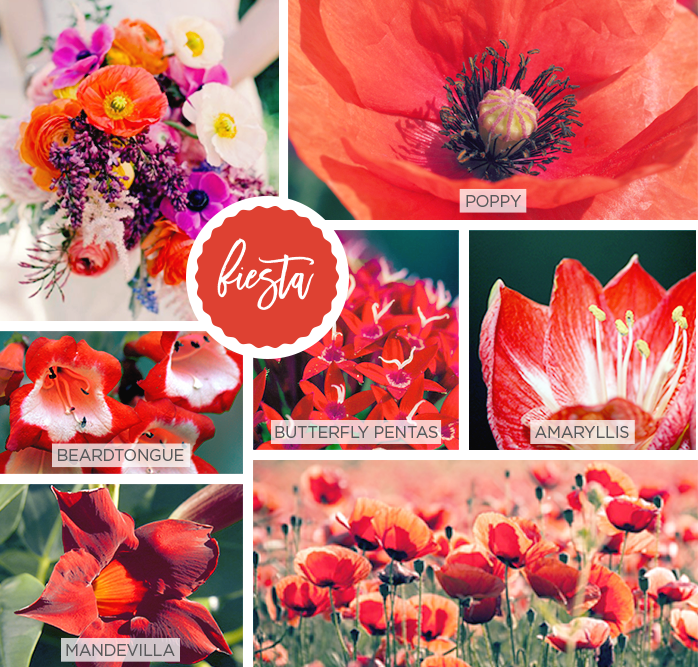
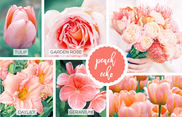
For their Spring 2016 palette, they added eight more colors, both vibrant and subtle, to create a balanced combination that aims to transcend cultural and gender norms and signify both excitement and stability.
These colors are great inspiration to use when sprucing up your home. The vibrant colors like fiesta and buttercup would work great for statement pieces to brighten up a space, while the softer hues are good for complementing existing design elements.
When integrating colors into decor, many follow the 60-30-10 rule where 60% of the room is a dominant color, 30% is a secondary color, and 10% is an accent color. This helps to tie together both neutral and bright colors, providing just the right amount of visual interest.
Colors also influence the mood of a room. According to the principles of feng shui, red stands for fame, understanding, and courtesy; yellow stands for reliable, calming, and centering; blue stands for communication, wisdom, and social interactions; and green stands for the beginning of new life.