
Ever wonder why a model home feels so good? Yes, they have no clutter and look far from lived in, but the main reason they feel warm and welcoming is the house’s color palette that is carried throughout the property.
By using a limited number of colors through the space in different ways, the home will flow from one room to the next by connecting each space with color. So, how do you create a whole color scheme for a home? I followed this method when choosing new colors for our home after Superstorm Sandy.
Start by picking 3-5 colors for your palette (this could be for the entire house, broken out by floors or even rooms). Your colors are completely up to you, but I recommend sticking to moreneutralor earth tone colors if your planning on moving soon. Not sure where to start?
Ask yourself the following questions:
What colors do you have to use because your already stuck with it?
Sometimes you have to start by working with what you already have to save money. Look at all the items that are in the home you might not be able to change — like flooring, cabinetry, tile or furniture. Every item in the room has a color undertone that should be considered before choosing a color palette. By looking at the color decide if the base color has yellow, green, blue, red or brown.Watch this video to learn more about undertones.
What are your favorite colors?
When you start with a color you and your family members love you won’t get sick or bored of it right away. It can be a great jumping off point for choosing other colors that work well together, just be careful with how you use those color favorites. Bold, dark or neon bright colors could be a paint disaster — you may want to use those colors to accessorize the room.
How should the overall space feel?
Every color stirs up an emotion and can influence a person on a subliminal level. This is color psychology. Do you want your home to feel rich and luxurious? Or like a retreat or spa? Maybe you want the space to entice the appetite? Color can help you capture a feeling so do some research to determine what you want your color story to be.
Playing with the Color Wheel — My Home Color Scheme
You can combine colors using a monochromatic, harmonious or complementary color scheme.
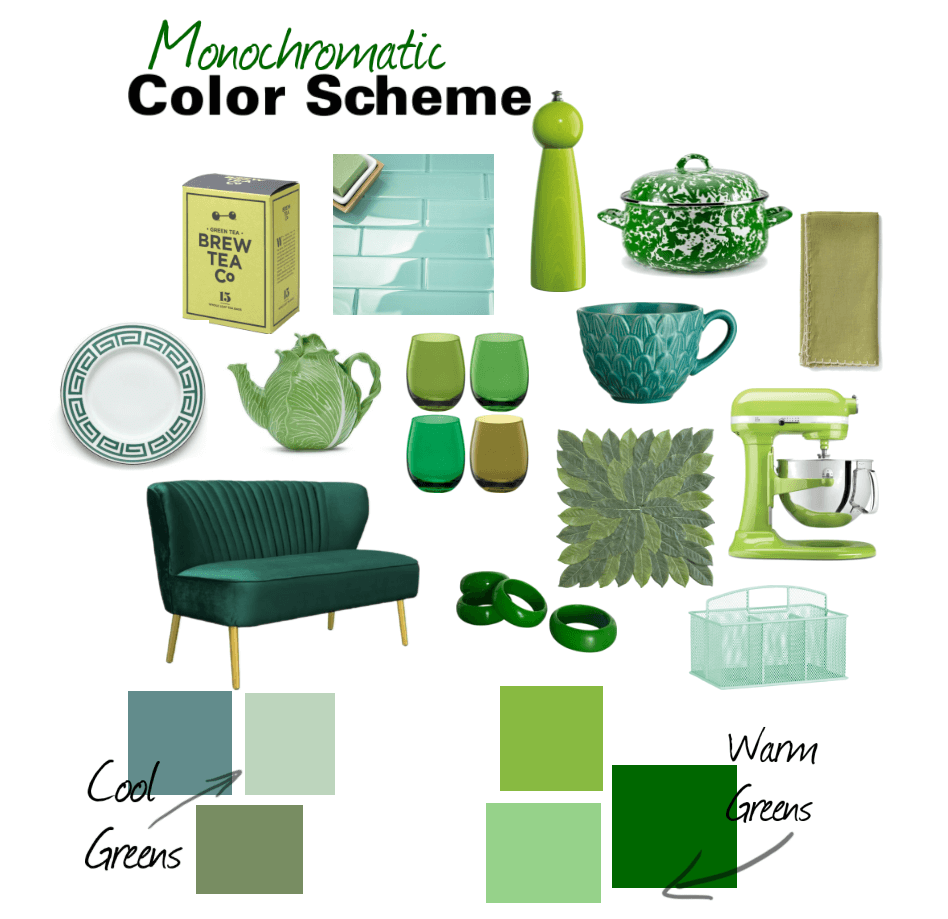 If you’re afraid of color a monochromatic color scheme is for you. If you want your space to feel modern and clean this too is the best way to utilize color. A monochromatic color scheme just means using the different shades, tints or hues of the same color. See all the different shades of greens you can use in a room to create interest and depth. It’s important to note that you can play with varying color temperatures too from cool greens to warm greens that are more yellow based.
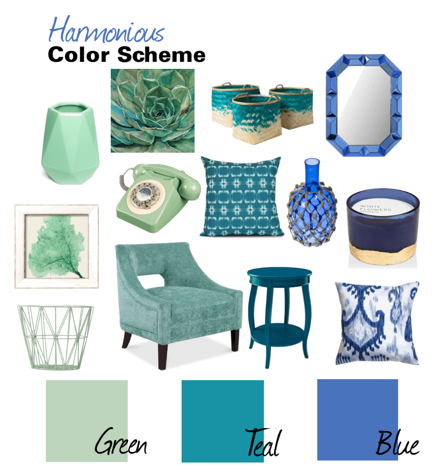
A harmonious color scheme uses colors that are next to each other on thecolor wheel. By looking at the image above doesn’t the color combo feel soothing? It creates a calm and relaxed vibe — truly living up to the meaning harmonious. These colors work well together because ultimately their made from one another.
Time to Choose Your Color Scheme
So, now that you have a better idea of how colors work together, here is a guide to help in the decision process when creating a color scheme for the home, because we all know the choices are endless –which can be a challenge all it’s own.
COLOR 1: Choose a Neutral
Neutrals go beyond beige these days. I love using neutrals on my walls to connect rooms together like in a hallway, entryway or open living spaces. The neutral color you choose should have a subtle shade or hue, if not then it’d be considered white. I’ve chosen to use a neutral color in my entryway, hallway stairs and kitchen on the main floor of the house, these areas connect other rooms together making it a seamless transition from one room to the next. What’s your perfect neutral color? Check out this post.
COLOR 2: Choose a White
Like neutral colors, not all whites are the same. They too have slight undertones that you need to look for, so choose a white that best goes with the undertones of the materials being used in that room. What is the underlying color of your flooring, cabinetry, tile or furniture that your stuck with? Traditionally this white will be used to paint trim, molding, doors, cabinetry and more.
COLOR 3: Go for a Bold Hue
This should that color you love to provide a starting point for the rest of your palette.This bold or saturated hue doesn’t necessarily have to make it on your walls, but it will be a color you can play with in accessories. If you’re scared of the color try taking the lighter hue of the color for accessories or paint.
COLOR 4: Choose Another Color
Playing off of color 3, you can choose a color scheme based on monochromatic, harmonious or complementary. If you’re going for a monochromatic color scheme choose a lighter shade of color 3. If you’re using a harmonious color scheme choose a color on the color wheel next to color 3. Finally, if you’re planning on a complementary color scheme choose the color opposite color 3 on the color wheel.
COLOR 5: Playing with an Accent Color
In a home color scheme this color may be an accent color in some areas of the home while the main color in other areas this will help tie all the rooms together while keeping the space interesting.
Now that you have a color scheme, it is all about using the colors differently in each room. The idea is to stick to your palette as a guide, but feel free to play with more color as you evolve and get more comfortable.
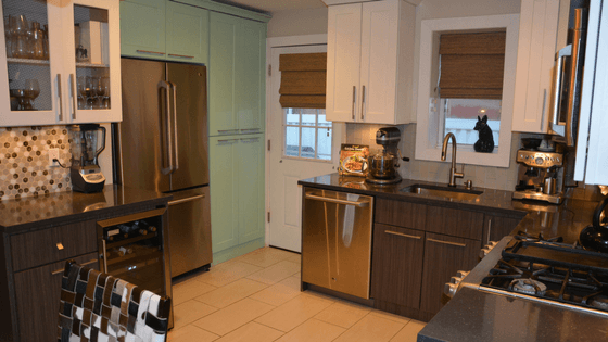
Kitchen Color Palette
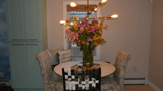
Dining Room Color Palette
Opposite the kitchen is the dining area, which is really just an extension of the kitchen. We used the same color scheme, playing off the green and neutral colors. The green cabinet can be seen from the living room, which we decided to embrace.
Living Room Palette
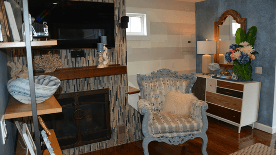
By using green as the jumping off point in the kitchen, we decided to do a harmonious color scheme in the living room. Using green, blues, grays, bringing in some neutrals and mixed metals as well we created a warm and welcoming feel as you enter the main living area.
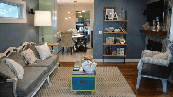
Here is another shot of the living room. We decided to paint the stair wall a neutral color to keep the room light and break up the dark blue. We repeated these colors in the tile wall also in the fabric in the accent chair.
Office Color Palette
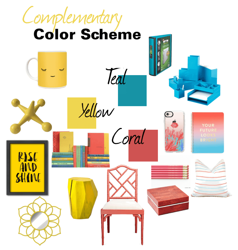
This room is off the kitchen, which can be seen from the entryway — but can also be closed off when needed by a barn door. Since, it has the flexibility of being apart of the main floor’s color scheme as well as being able to stand on it’s own we used a complementary color scheme using blue (teal) as a starting point. If you look back in the living room you’ll see our coffee table chest is the same teal color. We used teal in the office as the accent color and took it’s complementary color yellow as the paint color. We used a lot of white and gray to neutralize the space and popped the room with a coral color in the chairs and a few baskets. Again, if you go back to the living room picture you’re introduced to the coral color in a few flowers.

Don’t be afraid to use your color scheme in unique ways to create one cohesive look. As long as the same colors are continuously being used in the home you’ll have a continuous look that will just feel right. This won’t happen overnight that’s why it’s important to choose your colors and create a plan, our home is still a work in progress — but now we have a starting point for our next project. What’s your color starting point? Let me know in the comment section below. Also, I’d love to know your favorite colors.
Happy Decorating,