Neutral paint colors are a fool-proof way to add color and dimension to a room without over powering the space. Neutrals will never go out of style, because they’re timeless, making them a go-to choice when updating your walls and decor. This color palette is especially used in home staging to help highlight the best features in a home without distracting buyers with a bold red or dark blue –maximizing the home’s potential and square footage.
But first, be sure to test a color in the room firs using small swatches to see how the color will interact with the room’s lighting. Paint colors look completely different depending on the room and the natural light it receives. Check in throughout the day before committing to the color to make sure it’s the perfect fit for the room.
Neutrals colors doesn’t just mean white, gray or brown…
Rather they’re light to medium colors that are elegant and allow you the flexibility to change up your décor for each season. Most of the time when choosing a neutral color we are often picking a shade that is pretty light giving us just enough color to make our baseboards and moldings pop providing the perfect backdrop.
The problem is when dealing with light shades it’s difficult to determine what’s the color’s undertone — which can hurt or help the overall look. Every neutral has different colored undertones like grey, blue, yellow, brown, and green. That’s why choosing a neutral can be a challenge. Neutrals can be warm or cool, so you wan to look at the darkest shade on the paint swatch. It is where the color is the most obvious and it will tell you what undertones are going to show up, even in the lightest shades.
Neutral Paint Color Ideas for Walls

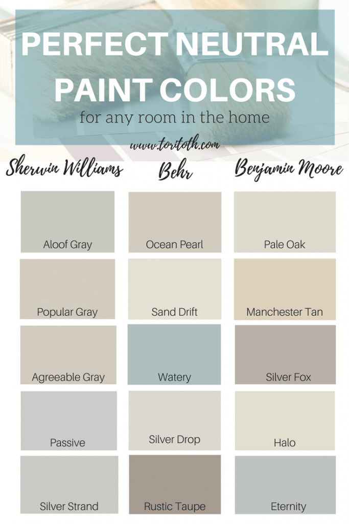
Aloof Gray– Sherwin Williams || Popular Gray – Sherwin Williams || Agreeable Gray – Sherwin Williams || Passive– Sherwin Williams || Silver Strand– Sherwin Williams || Ocean Pearl – Behr || Watery – Behr || Sand Drift – Behr || Silver Drop – Behr || Rustic Taupe – Behr || Pale Oak – Benjamin Moore || Manchester Tan – Benjamin Moore || Eternity – Benjamin Moore || Halo – Benjamin Moore || Silver Fox – Benjamin Moore
Let’s start with Sherwin Williams…
Aloof Gray this color has a touch of green in it, making it a cooler undertone.
Popular Gray this is a good go to modern color that works well if you have wood and tile materials with a brown undertone. This instantly warms up a space.
Agreeable Gray it is the perfect “greige” with a chic, clean appeal that is perfect if you are looking for a light gray – beige paint color.
Passive another light gray with cooler undertones, it can look blue or gray depending on the sunlight. Pairs well with other blues and greens.
Silver Strand one of the best paint colors to use in spaces with little or no natural light.
The Affordable, Durable Behr Picks…
Ocean Pearl again a “greige” with a hint of green would work well in a dining room or bedroom.
Watery this color is a soothing blue neutral that would go perfect in a harmonious color scheme.
Sand Drift the name says it all, this color looks like sand, clean, fresh and crisp shade that is amazing with white.
Silver Drop adds a hint of color to the wall that just wraps the whole room in a warm hue. This color looks amazing for a gallery wall with black and white photos.
Rustic Taupe while this color looks dark, it instantly makes a room feel cozy and comfortable.
Benjamin Moore Favorites…
Pale Oak is a soft, elegant “greige” category, that’s a lovely, fresh color if you want a true neutral.
Manchester Tan is a great choice if you love a tan neutral. It reminds me of a khaki that looks great on walls and brings some warmth to a space without appearing too dark.
Eternity I absolutely love this color and I’ve recommended it at least a dozen times to use in bathrooms, bedrooms, and even family rooms. It’s in my bedroom now and it’s a great color because it changes depending on the light being reflected. It’s a great color for southern facing rooms.
Halo it’s from Benjamin Moore’s off white collection and it’s not only sophisticated but has endless possibilities when it comes to playing up other colors. This color is so versatile.
Silver Fox it’s not really silver, but actually looks more like a gray-beige which is a good color combination to use in a room that you want to feel warm and cozy. When you put this color on your walls it’s almost as if you’re wrapping a blanket around you, so get comfy.
Keep in mind that regardless of the brand of paint you prefer, if you find a color in any brand, the paint store can color match it for you using the brand you prefer.
What’s in a Sheen?
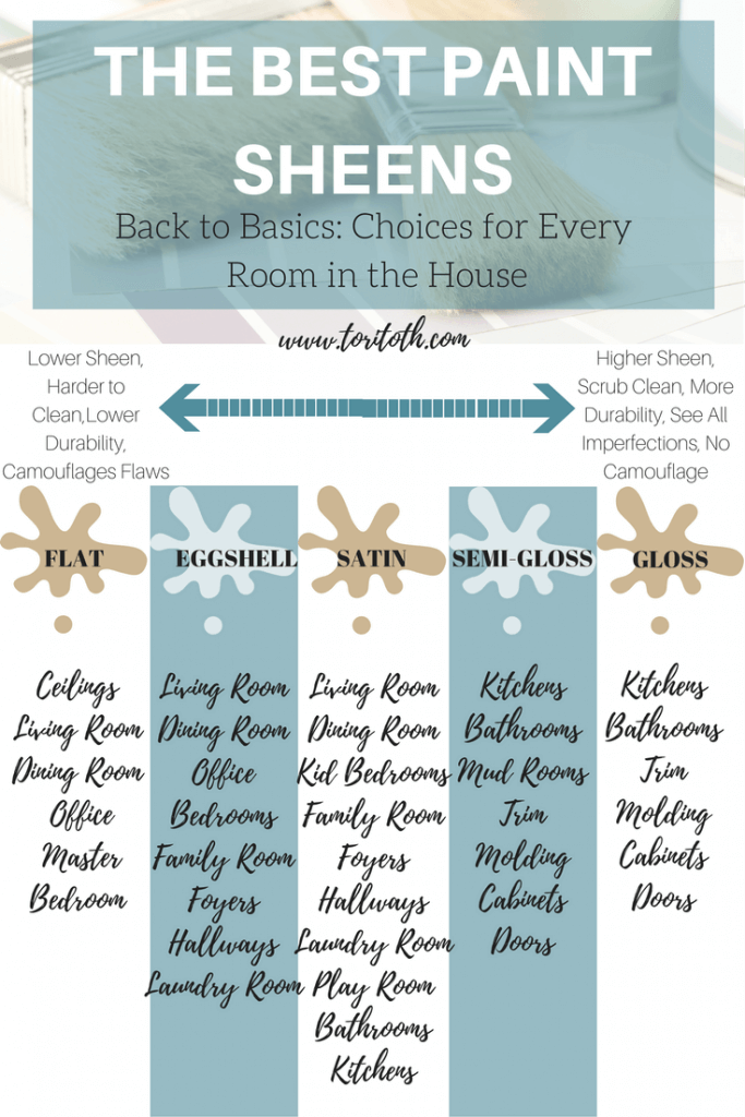
Now, despite choosing the perfect paint the sheen of the shade can make all the difference. Choose a lower sheen in secondary rooms like an office or master bedroom. A flat or eggshell might be harder to clean and have less durability, but it can camouflage flaws. Higher sheens, like semi-gloss and gloss are easy to clean, but you can see all the imperfections on the wall. Try using a higher sheen in kitchen and baths with their is a higher volume of traffic.

Let me know in the comment section below what’s your favorite neutral paint color — and tell me if you’ve got an upcoming paint project in the plan. My home needs a touch-up soon to cover knicks and cracks, but I will be staying neutral and highlighting key color in a few accent pieces.
Happy Painting,

